Final Music Video
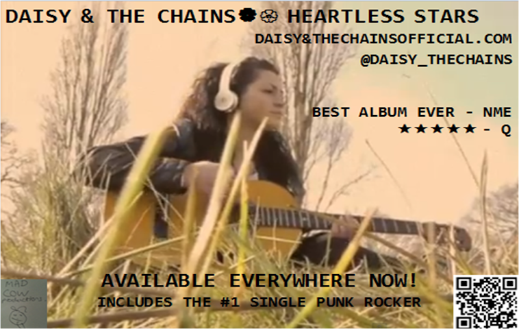
Magazine Advertisement
Digipak

Thursday, 29 November 2012
Inspirational Video: Sia- Breathe Me
Above is the official music video to 'Breathe Me' by Sia. I think this is an inspirational video for several reasons. I really like the simple yet creative technique used because it looks very interesting and very out of the ordinary. I think the idea of showing all the singers actions through a selection of polaroid photos is very thoughtful and represents the gloomy atmosphere and the lack of freedom in her life which also relates to the lyrics of the song. I would like to use something similar in my own video or in my digipak to reflect the iconography of the era as well as to represent the technological change because electronic photo frames are available due to technological advances which shows the dramatic change.
Wednesday, 28 November 2012
Band Brand
I have been brain storming some ideas and noting some down on a slice of paper and my group and I have come up with a selection of track names...
-The Gloomy Phone
-The Loveable Ladybird
-Technological Teapot
-Just Ben
-The Electric Vase
-Spaceships
-Forests and Polarbears
-Punk Rocker
I thought 'The Heartless Stars' would be an interesting album title and as most solo artists have memorable names such as 'Lady GaGa, Beyonce and Rihanna I thought the artist would be more memorable if she just went by one name like a first name or something different which is not very common. I was inspired by 'Marina and the Diamonds' and 'Florence and the Machine' and thought Daisy and the Chains could be a possible artist name as the lead singers name is Daisy which is nature related and the chains could signify how technology restricts society but Daisies make them feel free again as it signifies a field.
Tuesday, 27 November 2012
Digipaks: Generic Conventions
I recently brainstormed the generic conventions of digipaks and every successful digipak must contain the following...
-A Track list
-An Album Title: It is important that the album title is visible to the audience and it is usually on the first panel as it is the first panel the audience see.
-Photo of The Artist: This is so the audience become familiar with what the artist looks like including their unique image and how they are different from other musicians.
-Booklet with lyrics: This is appealing to the audience and encourages the listeners to familiarise themselves with the songs even more by learning the lyrics.
-Message To Fans/ Thank You Message: This shows that the artist is grateful for her fans and people listening to her music and is a message of appreciation.
-Awards Won: This is to publicise how well some of the songs or the whole album has done according to some contests or awards shows.
-Record Label: The record label for my digipak will be something specific to my genre of indie/pop.
-Bar Code

-Price
-Copyright

-Parental Warnings
-The Album/ Artists Name On The Spine
-Holographic Sticker

-Quotations: such as 'Featuring Hit Track '...''
Below are some ideas I would like to include when designing my digipak...
 I think poloroid photos are very retro and specific to the era my music video is based upon. By using some poloroid photo shots I think the artist can convey the message of a retro, old fashioned feel to some of her songs or some aspects of the album.
 I also thought it would be an interesting idea to use a photo strip as the audience can see a selection of clips from the music video on the album which could influence them to buy it.

This is the colour I was thinking of having as the background colour as it is both a neutral colour and a mature old fashioned colour. In addition the colour is not gender specific as it does not appeal to either gender in particular which is an advantage because both genders would be attracted to buy the album.
Below is a mind map of possible track names as well as a mind map of possible band names.
-A Track list
-An Album Title: It is important that the album title is visible to the audience and it is usually on the first panel as it is the first panel the audience see.
-Photo of The Artist: This is so the audience become familiar with what the artist looks like including their unique image and how they are different from other musicians.
-Booklet with lyrics: This is appealing to the audience and encourages the listeners to familiarise themselves with the songs even more by learning the lyrics.
-Message To Fans/ Thank You Message: This shows that the artist is grateful for her fans and people listening to her music and is a message of appreciation.
-Awards Won: This is to publicise how well some of the songs or the whole album has done according to some contests or awards shows.
-Record Label: The record label for my digipak will be something specific to my genre of indie/pop.
-Bar Code

-Price
-Copyright

-Parental Warnings
-The Album/ Artists Name On The Spine
-Holographic Sticker

-Quotations: such as 'Featuring Hit Track '...''
I am planning on including all of these generic conventions when designing my own digipak.
I have decided my digipak will have 4 panels as I think a simple yet creative digipak is more likely to attract a listener than a very complicated design with too many panels.
I have chosen the material to be 300gsm card with a gloss varnish to highlight the detail and contrast in a better way, and I was thinking of using dark colours like brown because I think this could signify a brown tea stained piece of paper which is from a different era which is similar to the idea of my music video as it is contrasted with the present day.
The dimensions of my digipak based on a 4 panel pak will be a finished size of 139.5mm x 6mm x 125.5mm
My digipak will be reasonably priced.
The digipak is a versatile packaging as it is environmentally friendly, it can be recycled and will not rot in a landfill site.
In addition my digipak could be made to accommodate a booklet either by placing in a die-cut slot or gluing it to one of the panels.
Below are some ideas I would like to include when designing my digipak...
 I think poloroid photos are very retro and specific to the era my music video is based upon. By using some poloroid photo shots I think the artist can convey the message of a retro, old fashioned feel to some of her songs or some aspects of the album.
This is the colour I was thinking of having as the background colour as it is both a neutral colour and a mature old fashioned colour. In addition the colour is not gender specific as it does not appeal to either gender in particular which is an advantage because both genders would be attracted to buy the album.
Below is a mind map of possible track names as well as a mind map of possible band names.
Saturday, 24 November 2012
Digipak Progress
I have started to plan the images which will be used in my digipak and I have come up with the idea of having a shaky font to represent the artist's feeling of imprisonment due to being trapped within the world of technology.
I have also decided to include a message from the artist to her fans on the second panel of the digipak as it shows the personal connection between herself and her fans.
I have also decided to include a message from the artist to her fans on the second panel of the digipak as it shows the personal connection between herself and her fans.
Friday, 23 November 2012
Goffman (1972)
Goffman believed that men and women are represented through different codes and conventions in advertising.
The deep male velvety voice-over reflects Goffman's theory of the voice-over authority as the man has a more controlling and serious voice which invites the audience in to listen more.
Superiority, Domination and Body Language:
He said that men are shown in dominant positions and appear to be reflective of thought and intelligence. Women are physically portrayed in sexual or reclining poses with blank or inviting expressions.
Dismemberment:
On females, parts of the body such as legs, chest etc are used rather than the full body. This is often applied to sell products which are not related to the body such as mobile phones. This is a sexist approach to sell products and focuses more on the female body parts more than the advantages of the product itself.
The advert below features both a man and woman, The different genders are represented in different ways through the different camera shots.
The black and white close up shot of the man with his face in the foreground and the simple mise-en-scene signifies that the male can dominate the frame without the use of any glamorous props which reflects the intelligence of the man.
However the bright artificial low key lighting in the frame including the girl focuses on her back and there are no shots of her face like the simple shot of the man. The shot of her back is revealing and the dark heavy make up sexualises her which conforms to the dismemberment theory.
The Voice-Over Authority:
In moving image advertisements, male voices are used as voice-overs in commercials rather than females. This is because lower pitched louder voices are sterner and more dominant and controlling so the audience are more likely to listen.The advert below features both a man and woman, The different genders are represented in different ways through the different camera shots.
The black and white close up shot of the man with his face in the foreground and the simple mise-en-scene signifies that the male can dominate the frame without the use of any glamorous props which reflects the intelligence of the man.
However the bright artificial low key lighting in the frame including the girl focuses on her back and there are no shots of her face like the simple shot of the man. The shot of her back is revealing and the dark heavy make up sexualises her which conforms to the dismemberment theory.
the establishing shot with the girl wearing the white dress signifies the beauty and purity of the perfume, but the focus on her legs is a sexist approach in comparison to the head shot of Brad Pitt. 

The deep male velvety voice-over reflects Goffman's theory of the voice-over authority as the man has a more controlling and serious voice which invites the audience in to listen more.
Thursday, 22 November 2012
British Film Institute
Today my media group and I attended a Media study day at the British Film Institute, which consisted of a conference with the chief examiner Pete Fraser in the morning, He gave us several tips on how to produce our music video as well as giving us a history of music videos. Below is a timeline of a history of music videos as well as a powerpoint presentation he showed us.
In the afternoon Corin Hardy, a music video producer came in and showed us several videos he had produced as well as commenting on each one and explaining hoiw he achieved the effects that were on the video. Below are a few of the videos that Corin has produced which I enjoyed and a copy of the programme of the day. I have also scanned a copy of the notes I made in order to guide me with my own research and planning.
Corin Hardy showed us an extended version of this video which is not available on the internet, I really enjoyed this as it was like a short film and there were an interesting range of shots used.
He also showed us the video below, This video has inspired me to include some similar shots in my own music video as they conform to the idea of nature vs technology.
I really like the above image as the focus in the frame is the flower and the lady bird sue to the out of focus background. I think this is a really intriguing shot as it presents nature in a very detailed yet simple way.
I also liked the focus pull effect of this image as the out of focus foreground of the short grass looking tall is very interesting and I would like to use a similar shot in my music video.
Wednesday, 21 November 2012
Digipaks
I am planning on using carbon neutral materials for my digipak or something similar and I am interested in designing a four panel digipak as this would look more appealing to the audience and won't look like the digipak is over the top.
Katy Perry 'Teenage Dream' album Digipak


Above is the Katy Perry 'Teenage Dream' album digipak. Her genre of music is similar to the song I am creating a music video for as it is a fun and quirky style which is represented through the bright colours used. The 'candy' theme used on both the CD and the digipak itself are still shots from her music video 'California Gurls' which relates to the artist and the album. I was also thinking of using still images from my music video on the back of my digipak to advertise the music video as well as highlight the messages that the artist conveys through her music. The artist has opted for the candy theme because everybody loves candy which is similar to the idea she is trying to convey because she is hoping that everybody likes her music. The candy theme is used throughout the digipak even on the tracklist which shows signifies that all of her songs create a happy and fun atmosphere.

The tracklist to the album is also listed below...
- Teenage Dream
- Last Friday Night (T.G.I.F)
- Califonia Gurls feat Snoop Dogg
- Firework
- Peacock
- Circle The Drain
- The One That Got Away
- E.T
- Who Am I Living For?
- Pearl
- Hummingbird Beat
- Not Like The Movies
Florence + The Machine 'Lungs' Digipak
Below is the 'Lungs' digipak, Florence + the Machine is also a similar genre to Sandi Thom which is why I have posted her digipak. Her digipak is rather simple, the front cover shows a mid shot of Florence wearing a necklace with lungs which have been enlarged, this signifies that the lungs are one of the most important aspects of the album. Also the lungs are gold which signifies their value and how much they are worth to each person. The back panel also has a picture of lungs and the tracklist is similar to the front panel as the font is rather simple. The low key lighting could reflect the dark and mysterious atmosphere of some of the songs featured on the album. The bright artificial high key lighting used on the CD is different to the rest of the digipak as the lungs are in the artists hand and they look golden which could represent the gold element which is rare and valuable which could be reflected through her songs.

- Dog Days Are Over
- Rabbit Heart (Raise It Up)
- I'm Not Calling You a Liar
- Howl
- Kiss With A Fist
- Girl with One Eye
- Drumming Song
- Between Two Lungs
- Cosmic Love
- My Boy Builds Coffins
- Hurricane Drunk
- Blinding
- You've Got the Love
Ellie Goulding 'The Writer' Digipak
Below is the 'The Writer' digipak by Ellie Goulding, The plain field on the back panel signifies Ellies tranquil personality and could represent the calming songs she includes on the album, However the scrawled writing could represent the happier and fun songs on the album. The natural high key lighting could represent the nature of songs as beautiful and peaceful like nature. The CD has a photo of her as well as her name and album title which is relatively simple in comparison to the Katy Perry and Florence CDs. The green field signifies the freedom which could reflect the freedom the listeners feel when they hear the songs on the artists album.

The tracklisting to this album is listed below...
- Our Song
- Hollywood
- When I'm Alone
- Belong With You
- Starry Eyed
- The Writer
- Guns and Horses
- Teardrops On My Guitar
- Shout
- You'll Find A Way
- Need You Now
Paloma Faith- Fall to Grace
Below is the digipak for the Fall to Grace album by Paloma Faith, I think this is a very interesting front panel but I don't like the idea of it being literal as I prefer the more subtle meanings behind the album photos. The dark artificial low key lighting could signify the hypnotising music, and the idea of the artist falling signifies the listener falling into another world when they listen to the songs on the album.

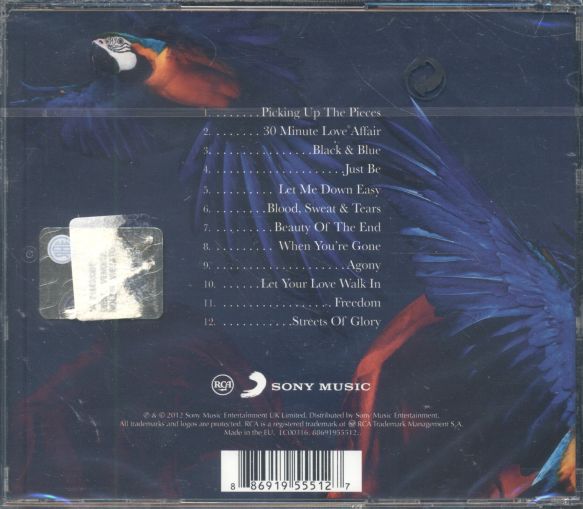
Lily Allen- Its Not Me, Its You
Below is the digipak to Lily Allen's album 'Its Not Me Its You. The font is large and bold which signifies that her music stands out compared to other artists of a similar genre to her. Also the writing could be so big because there aren't any photos of the artist on the album so the audience must be able to recognise the album cover from a long distance.

I have also started designing my own digipak and below is a mind map of what I have come up with so far.
Tuesday, 20 November 2012
Iconography...
Different aspects of iconography which I thought related to the theme of my music video are listed below...
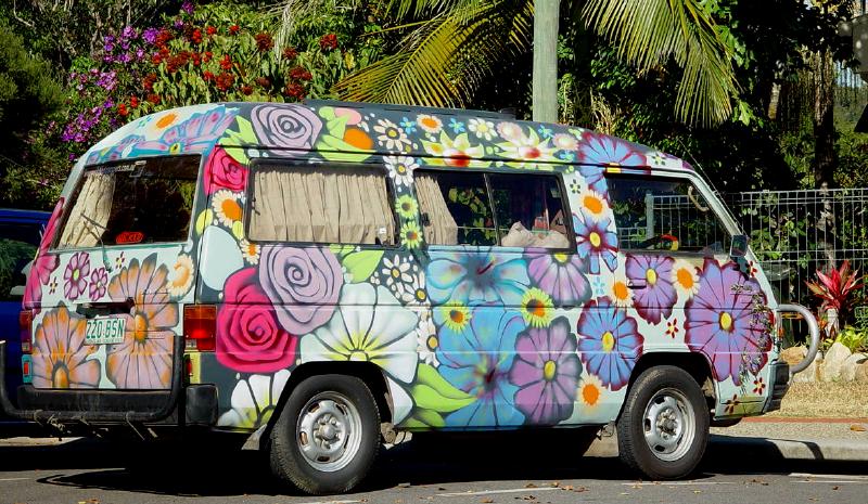 Unfortunately my group and I do not have access to a prop so exclusive the 60s/70s hippie period however I think it would be interesting to film random vehicles that don't look like ordinary cars and are specific to a different time period like the 70s as it will highlight the change of different things not just technology over time.



 I have seen several bracelets containing the peace sign and I think it would be a good idea to have a close up of the singer playing her guitar with the peace sign in full view in order to highlight one of the main icons of the 70s.

''Flower Power''
 Unfortunately my group and I do not have access to a prop so exclusive the 60s/70s hippie period however I think it would be interesting to film random vehicles that don't look like ordinary cars and are specific to a different time period like the 70s as it will highlight the change of different things not just technology over time.
I think this would be an interesting picture to include in the mise-en-scene of one of our scenes as it will emphasise the theme of our audience and highlight the differences we are pointing out to the audience.
''Retro Bike''

I thought using a retro bike would be really good for my music video because it contrasts the differences in transports because in today's day everyone would rather have a car than a bike, but in the 70s it was the other way around because everyone was more interested in saving the planet. I also think it would be good to film the singer on one of these as well as on a Boris bike to emphasise the difference and how bikes are slowly becoming more fashionable again.
''Peace''

There are many different signifiers which symbolise peace however this is the most obvious, I think it would be a good idea to subliminally fit little props containing this sign into the music video such as a piece of jewellery which has the sign on.
 I have seen several bracelets containing the peace sign and I think it would be a good idea to have a close up of the singer playing her guitar with the peace sign in full view in order to highlight one of the main icons of the 70s.
''Flying Birds''

Another signifier which symbolises peace is a flock of doves but doves aren't very common in London so I would like to include a flock of pigeons flying in the sky in my music video to represent peace.
Monday, 19 November 2012
Filming A Montage of Clips
Today I started storyboarding for the montage of clips that will be included in my music video, below are some possible shots I wish to shoot and include in my music video when my group go to film the scenes for the urban setting.
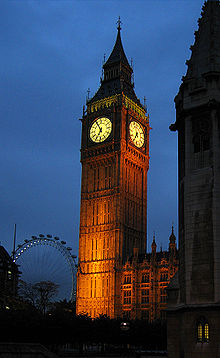
I thought it would be a really good idea to pan across the houses of parliament but because it is so big I'm not sure that will be possible so I thought it would be easier to shoot a low angle panning upwards shot of Big Ben and then zoom in to The London Eye and pan downwards, By doing this the montage could include a range of continuity editing and this would create interesting transitions. The 'So Sweet Nothing' music video inspired me to think of this idea.

I really liked the idea of filming St Pauls Cathedral from the end of Millennium Bridge because I like the positioning of the lines in the shot as they look appealing to the audience. In addition I really admire the dynamics of the lines as they look very interesting and I think shots like this are rather rare to find. I was also thinking about the signifier and signified idea and thought that St Pauls Cathedral could be a signifier like natures grave because it is quite old fashioned and specific to our genre, The singer in my video could be walking away from it towards the camera in the shot or she could be walking towards St Pauls Cathedral so it could represent the light at the end of the tunnel and the end of technology.

I thought it would be a really good idea to pan across the houses of parliament but because it is so big I'm not sure that will be possible so I thought it would be easier to shoot a low angle panning upwards shot of Big Ben and then zoom in to The London Eye and pan downwards, By doing this the montage could include a range of continuity editing and this would create interesting transitions. The 'So Sweet Nothing' music video inspired me to think of this idea.

I really liked the idea of filming St Pauls Cathedral from the end of Millennium Bridge because I like the positioning of the lines in the shot as they look appealing to the audience. In addition I really admire the dynamics of the lines as they look very interesting and I think shots like this are rather rare to find. I was also thinking about the signifier and signified idea and thought that St Pauls Cathedral could be a signifier like natures grave because it is quite old fashioned and specific to our genre, The singer in my video could be walking away from it towards the camera in the shot or she could be walking towards St Pauls Cathedral so it could represent the light at the end of the tunnel and the end of technology.
Sunday, 18 November 2012
Inspirational Song- No Doubt- Settle Down
Below is the official video to 'Settle Down' by No Doubt
I thought this was an inspirational video as I liked the bright colours and the 70s/80s feel to it which reminded me of a hippie period which my video will also be based on.
I really liked this split screen shot of the three colourful watches as it shows all the detail clearly and I would like to include a split screen similar to this in my own music video.
Saturday, 17 November 2012
Inspirational Video: Sweet Nothing- Calvin Harris ft. Florence Welch
Below is a voyeuristic video conforming to the gaze theory which I recently watched, I think this is an inspirational video as I like the way that the slow motion builds up suspense among the audience which makes them question what will happen next. I also liked the continuity editing within the three separate scenes when the man was being beaten up and falling to the ground and the camera switched to another scene to show the girl in the same falling position as the man which switched to another scene to show the girl falling to the ground. I thought this was a very interesting idea and I also think it would be a creative transition to use in my own music video when the scene changes from urban to rural.
Friday, 16 November 2012
Signifiers and Signifieds in Music Videos
Below is a table with some signifiers and signifieds found in the music video for Candy by Robbie Williams...
Thursday, 15 November 2012
Semiotics
Today's lesson consisted of semiotics and symbolic codes and signifiers. Below is the definition of semiotics.
Semiotics: The study of signs and symbols and their use or interpretations.
Symbolic codes are the signs we give to people either verbal or not. for example there are several ways of saying stop, it can be said verbally as well as non verbally. the non verbal ways of saying stop are listed below...


Ferdinand de Saussure: 'What does that sign say? It says nothing, it needs to be read'
Ferdinand de Saussure was a famous Swiss linguist who came up with the concept of signifiers and signified.
He said that the signifiers were the physical form of something which we can see or hear i.e words, pictures or music.
He also said that the signified is the meaning which we attach to the signifier i.e a red traffic light means stop driving and wait until the light changes colour.
In other words the signifier is the printed image and the signified is the idea or the meaning of the image.

Roland Barthes added to Ferdinands idea...
He called the way that these signifiers were organised and put together the 'symbolic code' of the text.
In my music video different signifiers and signifieds will be used, A rural location such a field is the signifier and the signifier could be freedom which represents the girl feeling free in the field.
Another signifier is a flower and the signified behind that could be nature which represents the nature Vs technology theme of my music video.
Semiotics: The study of signs and symbols and their use or interpretations.
Symbolic codes are the signs we give to people either verbal or not. for example there are several ways of saying stop, it can be said verbally as well as non verbally. the non verbal ways of saying stop are listed below...


Ferdinand de Saussure: 'What does that sign say? It says nothing, it needs to be read'
Ferdinand de Saussure was a famous Swiss linguist who came up with the concept of signifiers and signified.
He said that the signifiers were the physical form of something which we can see or hear i.e words, pictures or music.
He also said that the signified is the meaning which we attach to the signifier i.e a red traffic light means stop driving and wait until the light changes colour.
In other words the signifier is the printed image and the signified is the idea or the meaning of the image.

Roland Barthes added to Ferdinands idea...
He called the way that these signifiers were organised and put together the 'symbolic code' of the text.
In my music video different signifiers and signifieds will be used, A rural location such a field is the signifier and the signifier could be freedom which represents the girl feeling free in the field.
Another signifier is a flower and the signified behind that could be nature which represents the nature Vs technology theme of my music video.
Sunday, 11 November 2012
Day One of Filming!
Today Daisy and I started filming a few cutaway shots for our music video and we edited them in iMovie, Below is a photo of our progress so far as well as a short vlog outlining what we did including any issues we encountered.
We edited the stop motion shot of the flower by taking photos of the flower and removing a section of petals at a time which made it look very jumpy which was our desired look, also when the selection of photos is rewinded it looks like the petals are growing on the flower.
We are planning on making a flower appear when the eye reopens as it conveys the message of nature and anti-technology.
Wednesday, 7 November 2012
Inspirational Video: Gotye- Easy Way Out
Below is the official video to Easy Way Out by Gotye, I thought this was an inspirational video for various reasons. I liked the opening scene of the video which was a focus pull which could represent the storyline of the video to be a bit blurry and I also think the short clips being shown continuously could symbolise someone leading a busy lifestyle as well as someone multitasking. In addition I really liked this video as it reminded me of a moving comic strip.
Tuesday, 6 November 2012
Iconography
Today my group and I had a group discussion and came to the decision that it would be a good idea to use a montage of iconic events that have taken place during the 60s and 70s. We were inspired by the opening credits of Homeland, an american TV drama. A link to the opening credits to Homeland are below. Also I have researched some iconic events which took place during the 60s and 70s and I have converted them into a timeline which are shown above.
http://www.putlocker.com/file/9AF34C39A47C2428#
Subscribe to:
Comments (Atom)


